
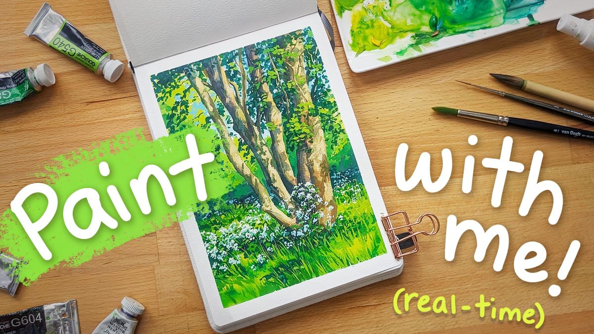
Create a Springtime Landscape with Dappled Light and Wildflowers 🎨🌿 Real-time paint along!
Hello art friends!
Thank you for the kind response to my previous paint-along video. Thanks to all of your lovely comments, I decided to create another! If you’d like to paint along or just relax and enjoy the video, you can find my new video here.
Today’s painting is based on a photo I took this Spring. You’re welcome to use it if you’d like to paint with me.
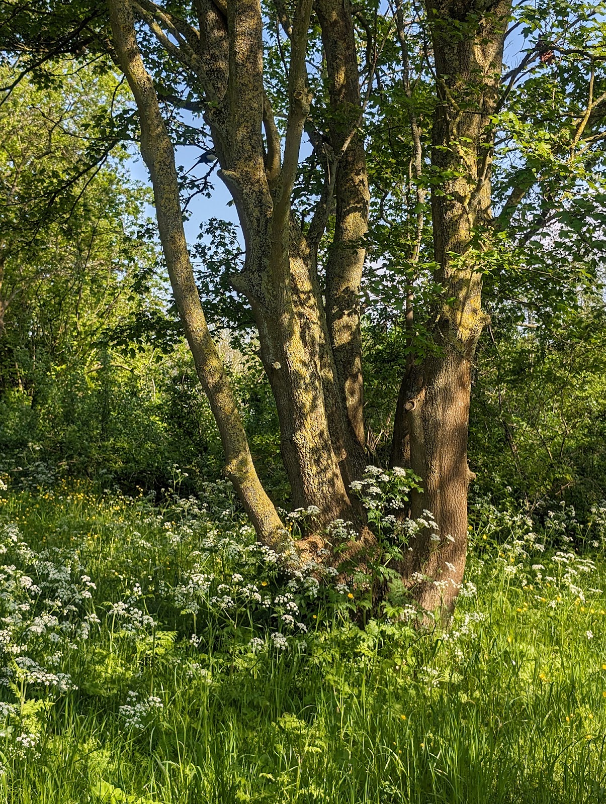
I love the happy feeling of this photo, and the depth created by the dappled lighting. Those are things I hope to get across in my painting!
COLOR PALETTE AND SUPPLIES I USE FOR THIS PAINTING
I’m sharing my color palette because I often get questions about it, so I hope it might be helpful! But please don’t feel like you need these exact colors to paint along. You can join me in painting with whatever paints you have on hand!
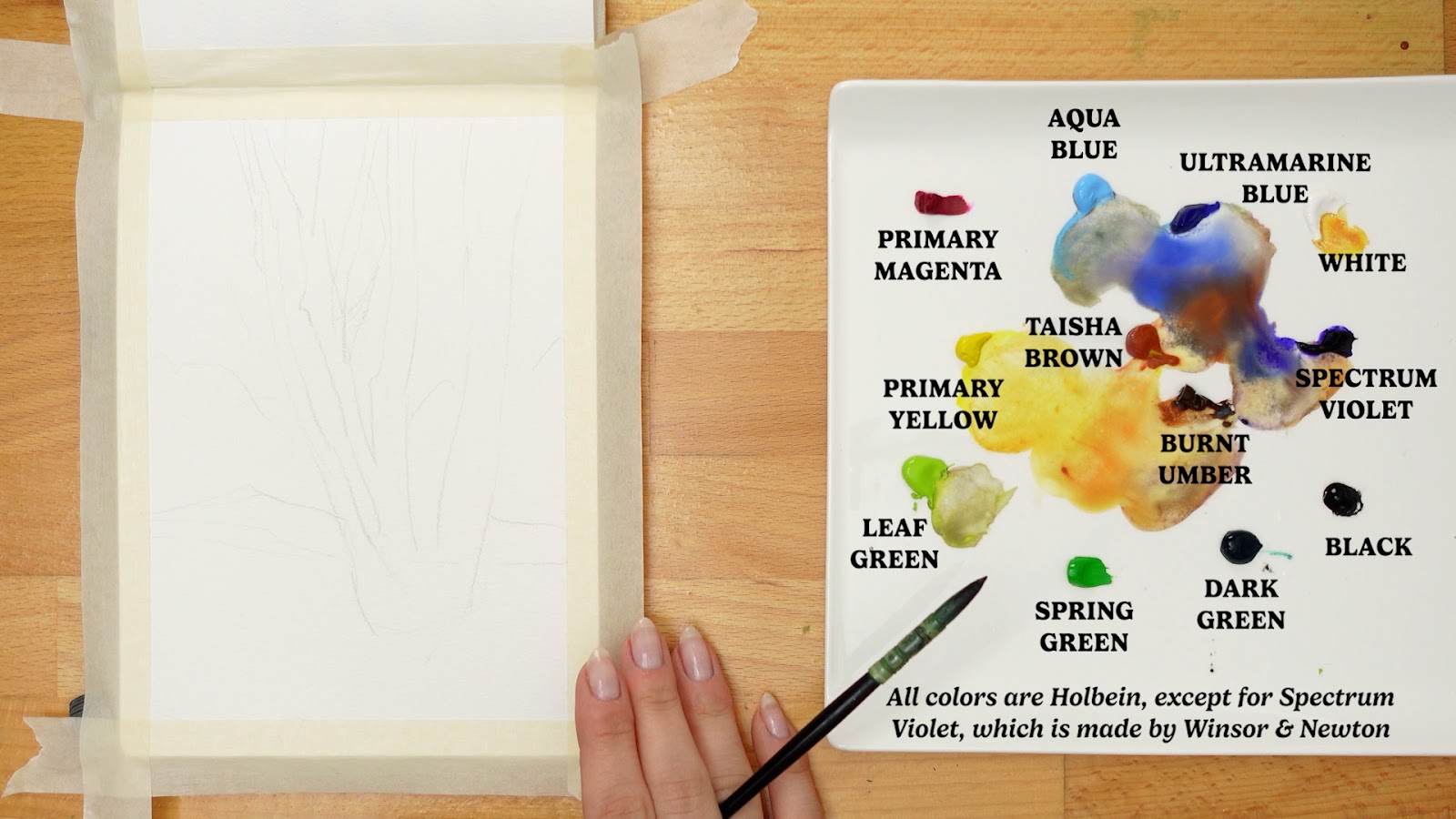
- Holbein Primary Magenta (G561)
- Holbein Primary Yellow (G652)
- Holbein Spring Green (G843): Part of the Holbein Summer Irodori Set
- Winsor & Newton Permanent Green Light
- Holbein Dark Green(G548)
- Holbein Taisha Brown (G831): Part of the Holbein Summer Irodori Set
- Holbein Burnt Umber (G604)
- Winsor & Newton Spectrum Violet
- Holbein Ultramarine Deep (G565)
- Holbein Aqua Blue (G570)
- Holbein Permanent White (G630)
- Holbein Primary Black: (G658)
During the video I mention a brush I got from a Japanese brushmaker Shougetsudo Co and that brush can be found here.
The other brushes and tools I use can be found on this page.
STEP 1: BASE LAYER
When I begin a painting, my goal is to block in big shapes quickly, and get rid of the white paper as soon as possible. So when I say, ‘Base layer’ I’m referring to that first pass of paint on fresh paper. I try to avoid putting a second layer of paint anywhere on the page until all elements of the painting have been painted with at least a first base layer.
When getting ready to block things in, it helps me to mentally break down the scene/composition into its main elements. In this scene, I see 3 main elements: The foreground foliage, the tree, and the background.
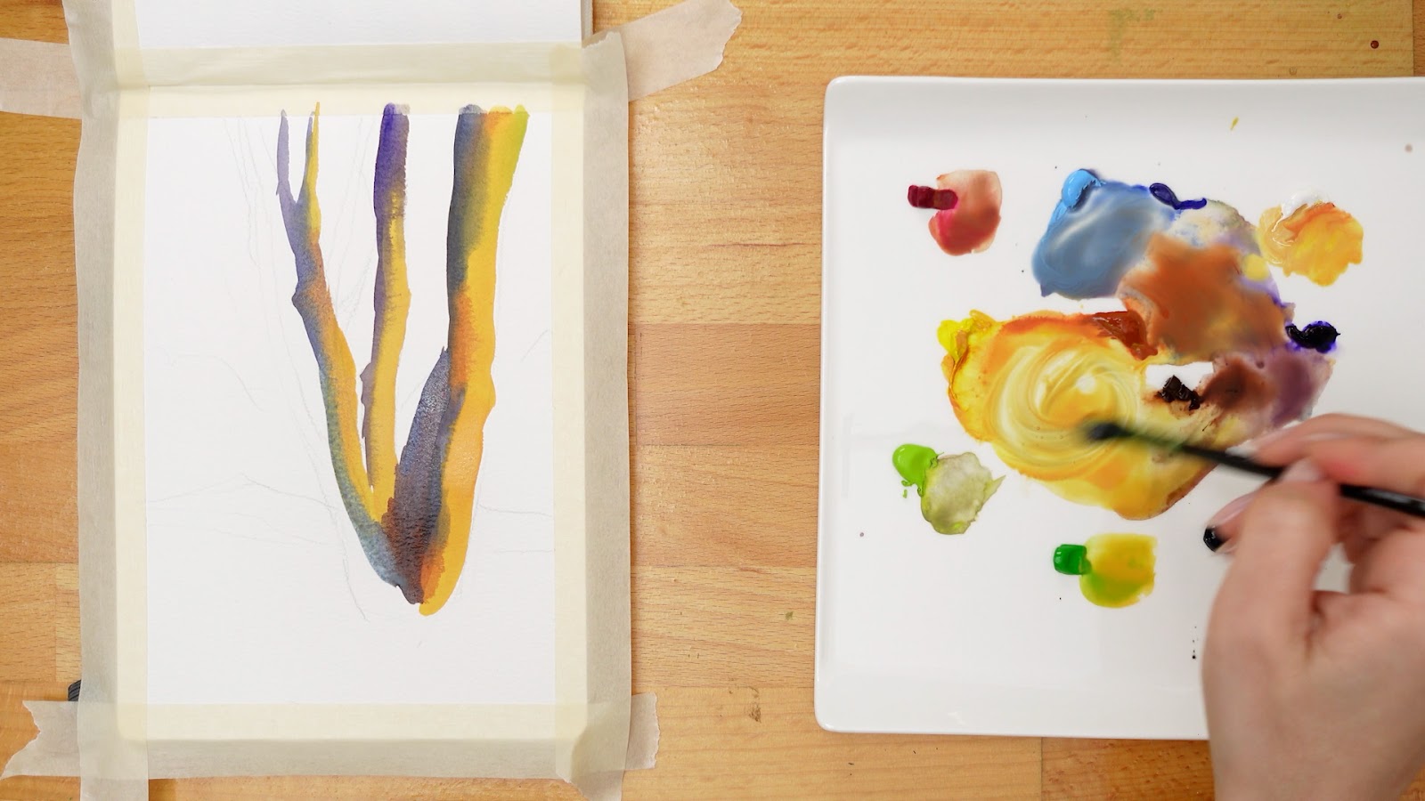
I decided to begin with the tree. I was thinking about lighting direction as I painted, focusing highlights on the right side of the trunks and shadows on the left. I tried to paint quickly enough that there would be a soft edge between the colors.
After the tree, I moved on to blocking in the grass. I had the same mindset here, allowing the wet paint to blend together on the page and give some soft, textured edges between the shadows and light areas.
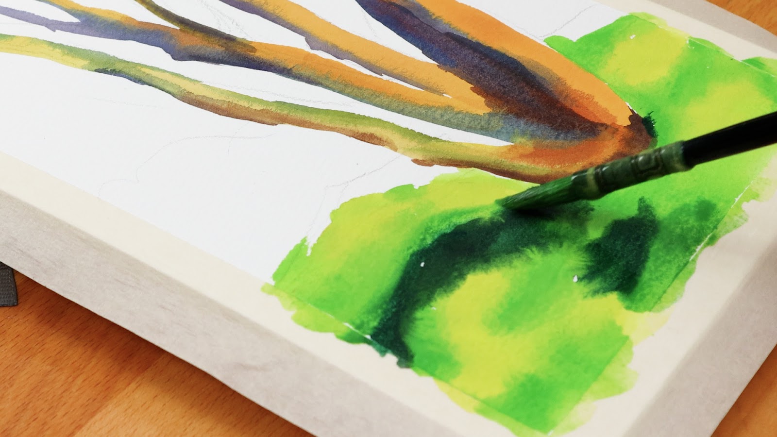
After the grass, I moved on to the foliage and sky in the background. While mixing colors, I tried to keep them slightly lighter and less saturated than the foreground.
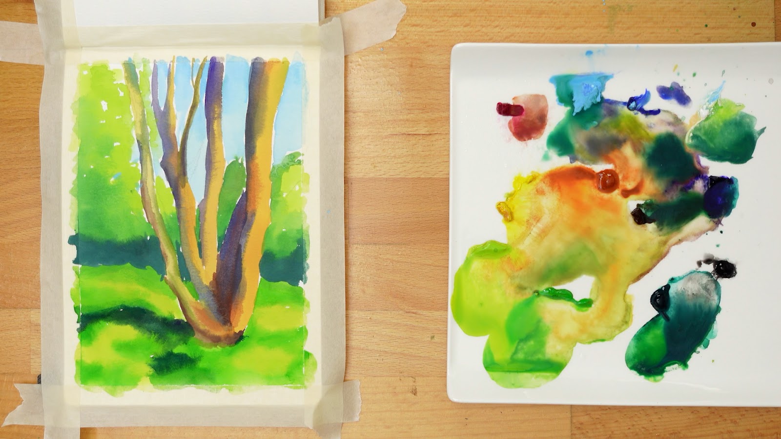
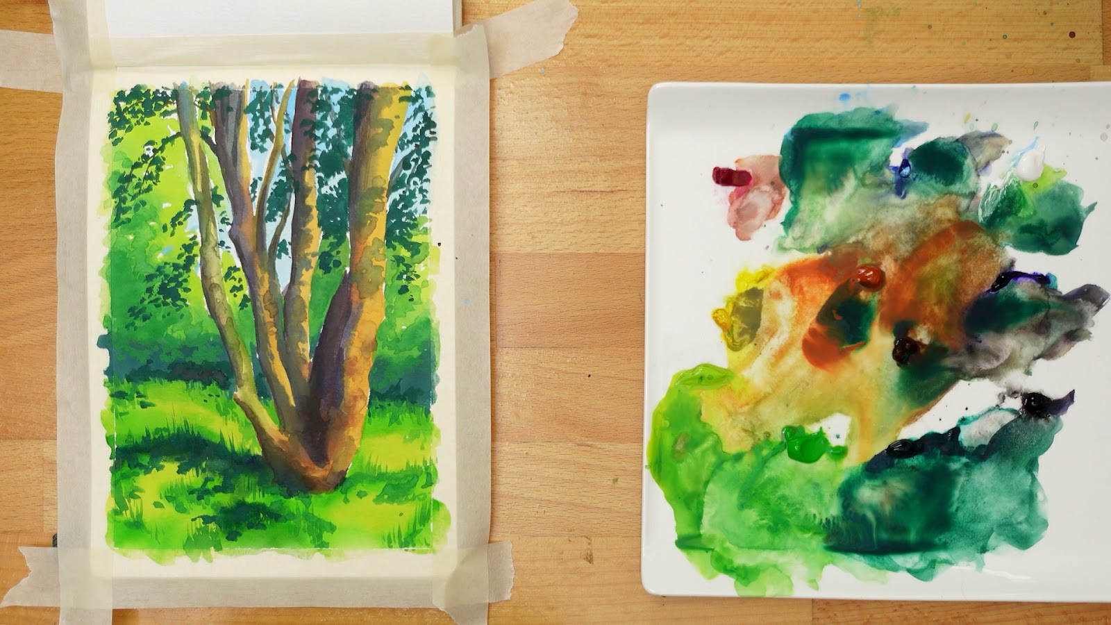
Here is the completed base layer!
STEP 2: LAYERING FIRST DETAILS
Step two = layer two! For this step, I return to each main section of the composition and add the next layer of paint and detail.
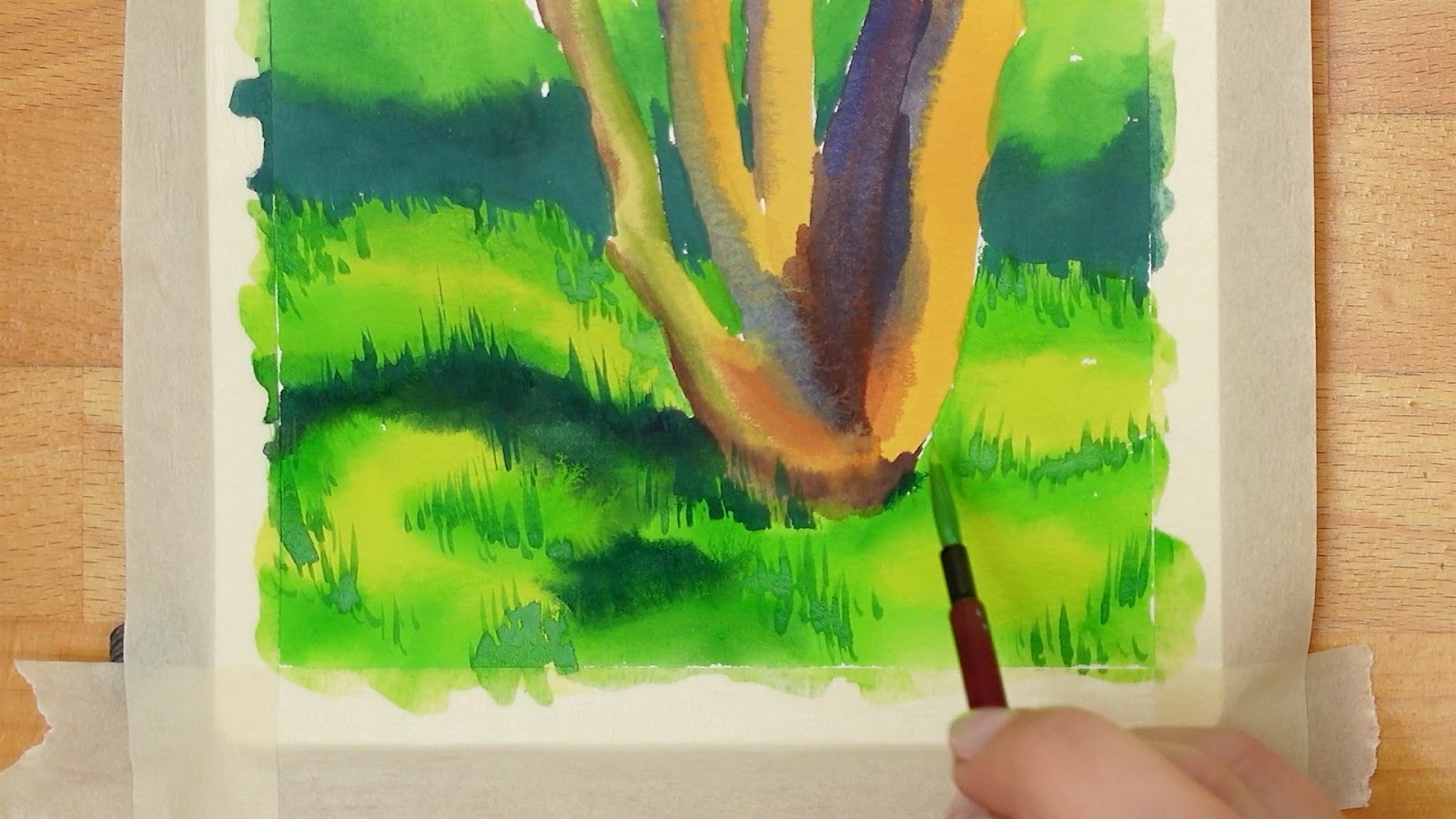
Starting with the grass, I focus my paint strokes in areas where shadow and light meet, where they can create a more bold and dramatic effect. I try not to fill in the grass entirely with detail because having some areas of rest will allow the grass to look softer.
After the grass, I move my focus to the tree. I’m painting shadows to give the look of dappled light (light shining through the tree foliage) and a slight texture of bark to the tree.
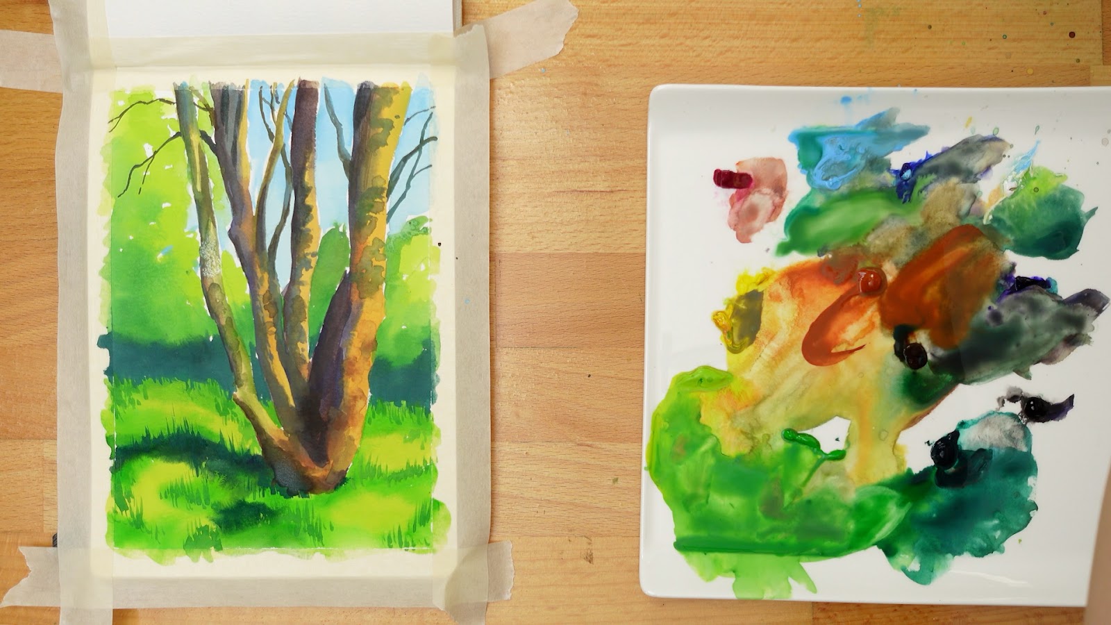
With the first pass of tree foliage, I try to group up leaves in bunches so they are clustered in a natural way as if they are coming off of the branches. I try to leave plenty of space for the sky and background to show through the leaves.
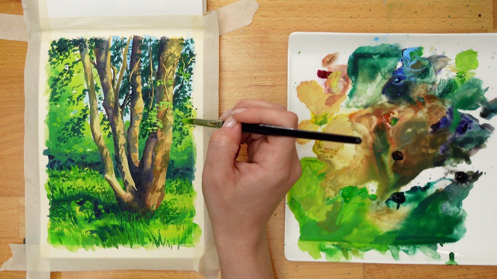
STEP 3: FIXING ISSUES AND ADDING DETAIL AND TEXTURE
Before starting this next step I took a few minutes break away from my painting which helped me to see my work more clearly again. One thing that stood out to me was the larger tree trunk on the right, which seemed too bulky.
My goal for the next step of the painting is to fix an issues like that which stand out to me, and to continue with texture and detail.
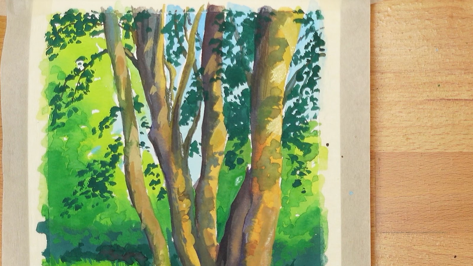
As I add highlights to the tree, I drag my brush in a diagonal direction sweeping downward to give the effect of dappled light streaking through branches onto the tree bark.
When the time comes to paint lighter leaves, it helps to use a more opaque paint mixture with only a little water. This way it has complete coverage and a nice bold appearance.
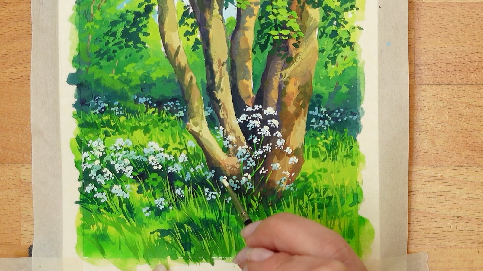
Painting the white flowers was probably my favorite part of the painting process! I tried to create a feeling of depth by emphasizing the difference in color temperature between the flowers in shadow which appeared more blue and those in sunlight which appeared a bright white. For the brightest parts of the flowers, I used white with a touch of yellow to give it some extra warmth.
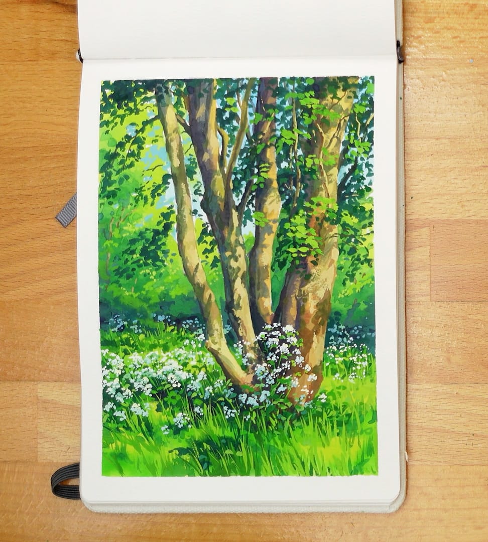
And here’s the final painting with the tape peeled off! I hope you like the end results!
This one was fun but also pretty challenging. The dappled light on the tree bark was the part I found the most tricky. I had to go back and forth with shadows and highlights a bit until I felt like it worked. I'd like to do some more studies with this kind of scene so I can get more practice with that dappled lighting!
If you painted along, I hope you had fun! Please feel free to tag me on my socials or share it in my discord. If you would like to request a future painting topic, please leave a comment on the Youtube Video for this painting and let me know what you'd like!
Prints of this painting can be found on my INPRNT shop.
See you next time! 💚
* I am not sponsored by the companies listed above, however, amazon links are affiliate links that help support me and my art if you make a purchase.
